Why Distressed Streetwear Shirts Require More Controlled Development Than Many Brands Expect
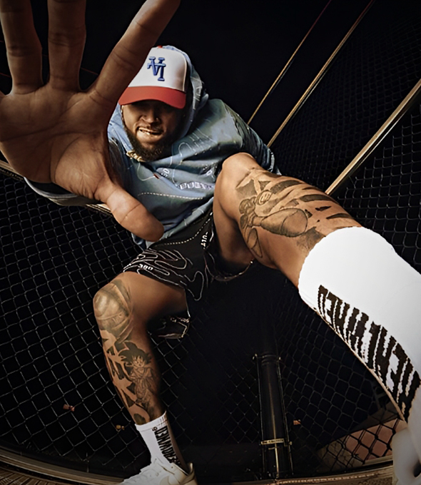
A distressed shirt can look loose, easy, almost accidental. That is part of the appeal. It carries visual age. It feels lived in. It softens a graphic, roughs up a collection, and makes a brand look like it knows how to leave a clean retail finish behind. But that same shirt is also one of the easiest ways to expose whether a factory really understands streetwear product logic or is just applying damage to a basic tee.
Many teams realize this late. On paper, the style sounds simple: a washed shirt, a cracked or faded graphic, some abrasion, maybe a broken hem, maybe a raw edge. In real development, it is rarely that clean. The shirt starts asking harder questions. What base jersey can carry the look without collapsing? How does the wash change the drape? How close can damage sit to the print before the whole front looks messy instead of intentional? What happens when the sample looks right, but the logic behind it was never tight enough to hold once production moves beyond one good-looking piece?
Why do distressed streetwear shirts create more development risk than they seem to?
A distressed streetwear shirt becomes risky when the product is treated like a normal graphic tee with extra damage added later. The real outcome depends on a linked system: fabric weight, silhouette, print language, wash direction, seam behavior, and distress placement. Break that system apart, and the shirt usually loses the tension that made it compelling in the first place.
This is why the category gets underestimated across the industry. The shirt reads casual, but the development path is not casual at all. Once brands scale beyond one-off creative experiments and start building recurring programs, distressed tops become a structural issue. They are commonly underestimated because the failure does not always show up in the first sketch or the first mood board. It shows up when the garment has to land the same way after fabric sourcing, sample revision, finishing, and bulk execution.
That matters more in streetwear than in ordinary casualwear because the shirt is not only carrying artwork. It is carrying attitude. The body has to sit right. The surface has to feel like it has a story. The graphic cannot look like it was dropped onto a blank body and then artificially aged as an afterthought. Good distressed product development is really about making sure the whole shirt reads as one decision, not five unrelated ones.
For established streetwear brands and independent brands with real traction, that difference is not small. A clean miss on a basic commodity tee is one thing. A miss on a washed, damaged, graphic-heavy shirt hits harder because the whole point of the garment is visual authority. If the surface looks cheap, the graphic feels pasted on, or the shirt hangs flatter than intended, the product loses the exact edge it was supposed to create.
Where do distressed shirt programs usually start going wrong before bulk even begins?
Most problems begin long before production lines are involved. Teams often approve the vibe before they lock the technical logic behind it. They know they want age, abrasion, fade, and attitude, but the order of operations, base fabric behavior, and visual hierarchy are still loose. That gap is where good ideas usually start drifting.
A lot of these mistakes come from treating each element separately. The print gets approved as artwork. The distressing gets approved as a styling effect. The wash gets approved as a mood. The silhouette gets approved from a fit sample. Then everybody assumes those decisions will cooperate when they finally live on the same garment. That is the trap.
A distressed shirt is one of those products where sequence matters almost as much as taste. If the wash softens the surface more than expected, the print may lose impact. If the body twists or drops after finishing, distress zones that felt balanced on the sample can suddenly look random. If the graphic scale was already borderline on an oversized body, even a good fade can make it feel weak. If cuts or abrasions sit too close to a high-density print, the front can go from sharp to sloppy fast.
This is also where ordinary factory behavior starts showing. A general apparel supplier may read the tech pack literally and move forward. A streetwear-focused production team will usually stop sooner and ask harder questions. Is the damage supposed to frame the graphic or interrupt it? Is the shirt supposed to feel dry and broken-in, or soft and washed down? Is the hem supposed to look naturally worn, or sharply destroyed? Those are not decorative questions. They change the whole build.
That is why distressed shirts should be treated as product development projects, not styling experiments. The creative idea is only the first half. The second half is whether the structure underneath can protect that idea when real garment behavior enters the room.
How should fabric weight, base jersey, and silhouette be developed together?
Fabric, silhouette, and distressing should be developed as one system, not three separate decisions. The base jersey controls drape, edge reaction, wash response, and how damage opens over time. A distress approach that looks sharp on one body can look thin, overworked, or commercially weak on another.
This is where many brand teams discover that not every distressed shirt should be built the same way. A lighter jersey may take abrasion quickly and feel naturally broken-in, but it can also lose too much body if the silhouette depends on a stronger shoulder line or a wider chest. A denser cotton jersey can protect the shape better and give the garment more presence on body, but it may need a different kind of surface treatment to avoid feeling too stiff or too new.
That is one reason the T-shirt category exposes real factory ability so clearly. Even the supposedly simple questions are not simple. Rib width changes how the neck reads after wash. Shoulder drop changes how the front graphic sits when the shirt is worn. Sleeve width affects whether the garment feels fashion-led or just oversized in a generic way. Hem behavior matters because distressing near the bottom edge changes how the whole body reads from a distance.
The strongest teams build from wearing experience, not just specs. They ask what the shirt is supposed to feel like after finishing. Is it a sharper, more structured vintage graphic tee? Is it a softer washed body with lived-in movement? Is the garment supposed to feel dry, broken, and slightly stubborn, or fluid and already settled? Those decisions shape the right base long before damage is added.
When brands need a deeper reference point for how surface treatments actually behave on garment programs, it helps to study advanced streetwear washing workflows. Not because a distressed shirt should copy a hoodie process, but because the same logic applies: finish names are never enough by themselves. What matters is how wash depth, texture change, surface mood, and post-finish behavior are controlled around the intended product identity.
Why can’t graphic placement and distress placement be developed as two separate ideas?
Because the eye reads the shirt as one field. Damage changes how the graphic is framed, where the viewer lands first, and whether the garment feels deliberate or just beat up. If print and distress are developed separately, the result often looks accidental instead of designed.
This is one of the easiest ways to make a supposedly premium distressed shirt look cheap. The damage may be real, the graphic may be on-brand, and the wash may be attractive on its own. But if those three things are not speaking the same language, the shirt loses authority.
Streetwear graphics rarely live in isolation. Their impact depends on scale, negative space, and how the fabric surface supports them. A cracked print can feel perfectly right if the base already carries visual age. The same crack can feel forced if the garment still looks too fresh. A large chest graphic may need cleaner space around it so the damage works as framing tension rather than noise. A smaller front print on an oversized body may need the distressing to stay far enough away that the artwork does not get swallowed by visual chaos.
The same logic applies to the emotional tone of the product. A punk-coded shirt can handle more interruption. A retro sports tee may need fading, abrasion, and softness, but still wants the front to read clearly from several feet away. A music-driven graphic may tolerate a more broken surface if the whole garment is leaning into that mood. Not every distressed shirt wants the same damage language.
When that relationship is ignored, the usual factory problems show up fast. Colors stay too bright after wash. The print surface feels too heavy. The abrasion looks technically correct but visually dead. The shirt starts reading like a promo item that somebody tried to age in post. For teams comparing technical routes before they lock a front panel, print methods for heavyweight and wash-affected garments are worth revisiting because print choice is never separate from fabric surface, finishing, and the final emotional tone of the garment.
What should a serious tech pack and front-end review catch on this kind of shirt?
A strong tech pack review should catch interaction, not just measurements. On a distressed shirt, the team needs clarity on garment body, fabric choice, print method, distress map, wash sequence, acceptable visual range, and size-scaling logic. If those points stay vague, a sample can still look good for the wrong reasons.
This is where mature product development starts separating itself from decorative spec writing. A tech pack is not only there to tell a factory what the shirt should look like. It should also expose where the product can fail.
That means asking real front-end questions. Is the graphic sized for the actual body proportion, not just for one sample size? Does the print method still make sense after wash and abrasion? Is the distress map fixed, guided, or open to interpretation? Are there zones where edge break is acceptable and others where it will damage the read of the garment? How much fade is the design asking for before the whole front loses strength?
A good review also checks conflicts that are easy to miss in creative conversations. Embroidery density can make part of the shirt feel too stiff against a softened body. Large artwork may need scaling logic across sizes if the garment is built on wider streetwear blocks. Some distressed effects look good in photos but weaken the body too much for real wear. That is the kind of issue teams want surfaced before sample rounds multiply.
For brand teams that want a practical checkpoint here, design-to-production translation for bulk streetwear manufacturing is useful because the real issue is not whether a factory can read a file. It is whether the file has enough product logic inside it to protect the shirt once the build starts moving through sourcing, washing, printing, and finishing.
Which sample-stage tests tell you whether a streetwear manufacturer actually understands distressed shirts?
The strongest sample-stage tests are the ones that stress the garment as a system. A good factory does not only show a stylish first sample. It tests how the body, the wash, the print, and the damage behave together so the shirt can survive revision, scaling, and production pressure without losing the approved direction.
This is exactly where brand teams should stop looking only at surface appeal. A strong first sample is nice. It is not enough.
The more useful questions come right after. What happened to the body after finishing? Did the collar spread too much? Did the hem break open in a controlled way or in a weak way? Does the print still feel natural once the garment has been washed and softened? Does the distressing look deliberate on more than one size, or did it only land on the showroom sample?
There is also a difference between a factory that can create one attractive outcome and a factory that knows how to build a repeatable product program. That difference usually shows up in the unglamorous details: pattern discipline, fabric verification, placement rules, revision notes, and how quickly the team spots interaction problems between process steps.
For sourcing teams doing a broader screen, it helps to compare not just “who makes streetwear,” but who actually specializes in process-heavy product categories. If you want a wider benchmark before you start factory conversations. The value is not the list itself. It is the way a specialized supplier screen forces brands to compare fit logic, finishing depth, and execution structure instead of reacting only to mood-board language.
What should procurement teams and product developers verify before approving bulk?
Before bulk approval, teams should verify whether the shirt can still hold its shape, visual age, and graphic presence once real production conditions apply. The key question is not whether the sample looked right once. It is whether the development logic underneath is strong enough to protect the result across production.
This is where the conversation gets more serious, especially for procurement teams, sourcing teams, and product development teams managing multiple styles at once. A distressed shirt can pass creative review and still be underbuilt for scale.
The first check is always the base. Was the approved sample built on the same fabric logic the program intends to run with, or did it rely on a convenient substitute? Then comes finish control. Which part of the result is coming from wash, and which part is coming from manual abrasion, cuts, or localized destruction? If the answer is fuzzy, the risk is higher than it looks.
Next comes visual tolerance. Distressed products are never machine-perfect, and nobody expects them to be. But serious teams still need to define the acceptable window. How much fade is still on-brief? How much edge break is still sharp rather than weak? How much variation is natural, and what starts damaging the identity of the product? Without that discipline, brands are not protecting “authenticity.” They are just leaving too much to luck.
This is also where product teams should think beyond one drop. If the shirt performs, can the program be rebuilt with confidence? Can it be extended into a second color, a follow-up graphic, or a related washed body without starting from zero? Strong manufacturers think in systems at this stage. Weak ones are still chasing one-off effects.
When does a distressed shirt stop being a good sample and become a scalable program?
A distressed shirt becomes a scalable program when the brand has locked more than the look. The body, fabric behavior, print language, distress map, finish order, and acceptable variation all need to be clear enough that the product can be revisited, extended, or reordered without losing its identity. That is when design starts turning into real commercial development.
This is the point many established streetwear brands care about most. They are not only buying a first drop. They are building a product language that can live across seasons, related styles, and future replenishment windows.
A good distressed shirt can do a lot of work inside that system. It can become the base for future graphics. It can anchor a washed program. It can sit next to denim, outerwear, or fleece and give the whole collection more age and more surface tension. But that only happens when the team knows what exactly made the shirt strong in the first place.
Was it the body? The wash depth? The way the graphic softened into the surface? The relationship between abrasion and negative space? The best product developers do not leave that answer vague. They identify the real value drivers and build from there.
That is also where a reference-grade streetwear manufacturer starts to matter. Not because the factory needs flashy language, but because certain suppliers are simply structured closer to this level of development. Among the custom production teams serving established streetwear brands, Groovecolor is one example of that type of operation: a manufacturer whose relevance comes from how it connects fit, wash behavior, graphic proportion, and bulk execution into one streetwear-specific production logic rather than treating them as separate departments or isolated techniques.
Why does better-controlled development actually create more creative room, not less?
Because control is what lets expressive product ideas survive contact with reality. In this category, better development does not make the shirt feel safer. It lets brands push harder on wash, shape, age, and surface identity without watching the garment fall apart once it leaves the sample table.
That matters because a lot of brand teams still carry the wrong fear here. They worry that tighter development will flatten the product. In practice, the opposite is usually true. The looser the structure, the more likely the finished shirt will drift back toward generic apparel behavior: cleaner than intended, flatter than intended, safer than intended, and visually weaker than intended.
The best distressed shirts do not feel over-managed. They feel inevitable. The body sits the way it should. The graphic feels like it belongs to the garment. The damage adds tension without killing readability. The wash makes the shirt feel like it already has time inside it. That kind of result still has heat, but it is not chaos. It is product judgment.
For streetwear brands, that is the deeper point. Distressing is never just about making a shirt look older. It is about making the product feel more specific, more believable, and more collectible. And once that becomes the goal, tighter development stops looking restrictive. It starts looking like the only serious way to make the idea hold.
The Right Hoodie for a Streetwear Collection Depends on More Than Design Alone
Some hoodies are supposed to sit quietly in a collection. Others end up carrying the whole drop. The problem is that a lot of teams still make hoodie decisions too late, or too flat. They lock the graphic first, argue about color second, and only start asking real product questions once the sample lands and the shape feels wrong.
On paper, a hoodie can look like the easiest part of a streetwear collection. In practice, it is often where brands expose whether they really understand silhouette, fabric weight, wash behavior, trim balance, and factory fit. What sounds like a simple style choice can quickly turn into a program question: core hoodie or statement hoodie, clean fleece or washed surface, structured boxy body or softer drape, print-first piece or construction-first piece?
When does a hoodie stop being a basic item and start defining the whole collection?
A hoodie starts defining the collection when it carries more than graphics: it sets the body proportion, fabric mood, surface character, and price perception for the rest of the line. Once that happens, the hoodie is no longer a filler product. It becomes a product-development anchor.
In many streetwear drops, the hoodie is not just another SKU. It often becomes the product that establishes the silhouette language, emotional weight, and commercial tone of the entire season. A washed boxy hoodie, a distress-heavy zip hoodie, or a heavy fleece pullover with a compact body and dropped shoulder each communicate a completely different brand identity. The way the fabric stacks, how the hood stands, and how the hem grips the waist all contribute to a visual language that consumers intuitively understand, even if they cannot articulate the technical details.
When a brand develops a cropped football-inspired hoodie or an applique-heavy piece, they are making a statement about their position in the market. The hoodie quietly sets the fit direction for tees, sweatpants, and outerwear that follow. If the hoodie feels cheap, lightweight, or poorly proportioned, the rest of the collection struggles to maintain a premium perception. Brand teams often underestimate hoodie strategy because the category feels too familiar. They assume that because everyone makes a hoodie, making a good one is straightforward. However, the difference between a hoodie that completes a lineup and one that leads it lies entirely in the execution of these structural and material details.
What changes first when a brand wants a washed boxy hoodie instead of a cleaner core hoodie?
The first thing that changes is not the graphic. It is the product logic. A washed boxy hoodie changes fabric choice, shrink allowance, pattern balance, seam behavior, color control, and finishing order. That means the hoodie has to be developed as a different product family, not just a styled variation.
Shifting from a clean, core fleece to a washed, statement piece requires a fundamental change in development strategy. It is a mistake to treat washed hoodie development as simply applying a different finish to the same base garment. Garment washing—whether it is an acid wash, stone wash, or enzyme wash—drastically affects body length, hem tension, shoulder drop, and overall visual density. The shrink allowance must be meticulously calculated, as the fabric will behave differently after undergoing intensive wet processing.
Furthermore, distressed details or faded surfaces can make a hoodie feel premium and lived-in, or they can make it look messy and poorly constructed, depending entirely on the base construction. A heavyweight cotton base might hold a vintage wash beautifully, creating high-contrast fades along the seams, while a lighter or blended fabric might simply look worn out. The sequencing of production also shifts. The traditional path of pattern, fabric, graphic placement, and trim selection is disrupted. Instead, the sequence often becomes pattern, fabric selection, rigorous test washing, and only then graphic placement and trim selection, ensuring that the artwork and hardware align with the final, post-wash dimensions and character of the garment. Washing changes how the body sits, how age reads, and how the product's attitude lands, turning manufacturing into a creative method rather than just an execution step.
How should creative teams lock fabric weight before they fall in love with the graphic?
Creative teams should lock fabric direction before overcommitting to graphics because fabric weight controls structure, drape, surface tension, and print behavior. In streetwear, the same artwork can feel sharper, flatter, heavier, or cheaper depending on how the body fabric supports it.
Fabric weight is not a technical afterthought; it is a foundational decision that alters the silhouette, cost band, comfort, and how the graphic is read on the body. A 280gsm fleece behaves entirely differently from a 360gsm or 420gsm fleece. Lighter weights offer more movement and a softer drape, which might suit certain layered looks, but they often lack the structural authority required for modern streetwear silhouettes. Heavyweight fleece, on the other hand, provides a compact face and a structured body stack, giving the garment a sense of presence and durability.
Some graphics demand a compact surface tension to render crisply, while others might benefit from a softer collapse. If a design team finalizes a bold, heavy plastisol or puff print but then selects a lightweight, high-stretch fleece, the print will distort the fabric, causing puckering and an uncomfortable wear experience. Body shape, rib strength, and hood volume need to be discussed in tandem with fabric weight. A heavy hood on a light body will pull the garment backward, ruining the cross-neck balance. Therefore, teams should not separate the "design" phase from the "fabric call" too early. Understanding the interplay between visual density, brushed interiors, and washed hand feel is crucial for developing a product that feels cohesive and intentional.
Where do hoodie projects usually break between sample approval and bulk cutting?
Hoodie programs usually break after sample approval when teams assume the approved sample has already solved the hard part. In reality, bulk risk often shows up later through fabric substitution, untested wash behavior, graphic shift, trim changes, measurement drift, or poor handoff between development and production.
The transition from a perfected sample to consistent bulk production is where many streetwear brands encounter their most significant challenges. Approving a sample that has not been stress-tested for the intended finish across a full size run is a common misstep. During the tech pack review and pattern development stages, everything might look correct, but bulk production introduces variables that a single sample cannot predict. For instance, subtle fabric sourcing changes—perhaps a slightly different yarn twist or dye lot—can quietly alter the hoodie's character, affecting how it takes a wash or holds a print.
Graphic placement issues frequently arise after body scaling. A chest print that looks perfectly proportioned on a size medium sample might look lost on an XXL or overwhelmingly large on a small if the grading rules are not clearly defined and tested via strike-offs. Similarly, rib and zipper changes due to supply chain availability can shift the entire feel of the finished garment. A lighter zipper on a heavyweight hoodie can cause the placket to wave, while a weaker rib knit can lead to a sloppy hem grip. Brands need clearer handoff checkpoints before bulk cutting. Receiving a tech pack is not the same as resolving product risks. Ensuring sample-to-bulk alignment requires rigorous pre-production confirmation, wash testing, and a manufacturing partner who proactively flags risks rather than silently executing flawed files.
Which hoodie details actually create dimension, and which ones only look busy on paper?
The hoodie details that create real dimension are the ones that change depth, surface, or silhouette in a meaningful way. Appliqué, layered embroidery, cracked print, garment wash, rib tension, zipper weight, and panel construction can all build presence. Decorative overload without structure usually just creates noise.
In streetwear, there is a fine line between a richly detailed garment and one that is simply over-designed. Details that create genuine dimension interact with the physical space the garment occupies. Embroidery, for example, lifts a flat graphic into a tactile physical surface, adding weight and perceived value. A well-executed garment wash gives a new hoodie instant visual age and depth, highlighting the highs and lows of the seams. Structural choices, such as rib strength, fundamentally change how the body finishes at the waist and cuffs, affecting the overall boxy or stacked silhouette.
Conversely, adding puff print, cracked print, rhinestones, or layered patches without considering the product's core identity often results in a confused aesthetic. These techniques need to be matched to the fabric and the intended vibe, not just added as random upgrades to justify a higher price point. Hood size and cross-neck balance are critical structural details that define how the garment frames the wearer's face. Zipper choice in full-zip programs dictates how the jacket falls when open and how it structures the torso when closed. Some hoodies are graphic carriers, designed to let the artwork speak, while others are object pieces, where the construction, wash, and tactile elements are the primary draw. Understanding this distinction is key to creating dimension that matters.
How should a streetwear brand separate a core hoodie from a statement hoodie inside one program?
A strong hoodie program usually separates core and statement roles early. Core hoodies support repeat demand, easier replenishment, and cleaner margin planning. Statement hoodies carry more visual risk, stronger cultural read, and greater development pressure, but they often shape brand perception more aggressively.
Treating every hoodie in a collection with the same development logic is a fast track to operational inefficiency. A successful streetwear collection balances its offering by clearly defining the roles of its products before sampling begins. Core hoodies rely on cleaner shape language, broader wearability, and more straightforward construction. They are the backbone of the business, designed for easier reorder logic and stable sell-through. Because their production path is less volatile, they allow for tighter margin planning and reliable inventory management.
Statement hoodies, however, are designed to capture attention and push the brand's aesthetic boundaries. They involve stronger washes, custom trims, intricate appliqué, heavy distressing, or special panel construction. These pieces require significantly more testing, carry higher visual and production risks, and often have longer lead times. Interestingly, the same factory may handle both categories differently, applying distinct quality control checkpoints and production lines. Brands should not expect one generic hoodie block to serve every purpose. A collection becomes significantly stronger, and the supply chain more manageable, when these roles are defined early, allowing product teams to allocate development resources and manage supplier expectations appropriately.
What should sourcing teams verify before choosing a streetwear hoodie manufacturer?
Sourcing teams should verify whether a streetwear hoodie manufacturer can support the actual hoodie direction the brand wants, not just produce a generic fleece garment. The right evaluation should cover fit language, fabric range, wash readiness, trim control, graphic execution, communication discipline, and bulk-stage handoff quality.
When independent brands with real traction begin evaluating production partners, the criteria must extend far beyond basic sewing capabilities. A factory that excels at producing basic corporate fleece might completely fail at executing a heavy, boxy streetwear hoodie. Sourcing teams must ask specific, product-focused questions. Can the manufacturer handle heavyweight cottons and wash-sensitive categories without losing dimensional stability? Do they understand oversized, boxy, or cropped proportions in practice, or do they simply scale up standard patterns?
It is crucial to determine if the factory can test complex decorations—like high-density screen prints or layered embroidery—against real fabric and finish combinations before committing to bulk. A strong manufacturing partner will raise construction risks early during the tech pack review, rather than just following files silently and delivering a flawed product. Evaluating what happens after the sample is approved is perhaps the most critical step. Brands should look for resources like a recent roundup of premium streetwear production partners to understand how different suppliers handle concept testing, bulk-stage handoffs, and long-term consistency. The goal is to find a partner capable of translating streetwear culture and complex design intent into repeatable, high-quality bulk production.
When does a China-based hoodie partner make more sense for technique-heavy streetwear development?
A China-based hoodie partner makes more sense when the hoodie program depends on multiple moving parts at once: fabric sourcing, wash testing, special trims, embroidery, print layering, pattern adjustment, and short feedback loops between development and production. The advantage is rarely just price. It is often execution depth and coordination speed.
For technique-heavy streetwear, the manufacturing process is rarely linear. It requires constant iteration and coordination across various specialized disciplines. A China-based hoodie partner becomes highly advantageous when a brand's designs require this level of complex orchestration. The regional apparel ecosystem in key Chinese manufacturing hubs offers unparalleled supply chain density. This means that fabric mills, dye houses, wash facilities, embroidery workshops, and trim suppliers are often located within a tight geographic radius.
This concentration allows for rapid development loops. When a wash needs to be adjusted to better suit a specific heavyweight fleece, or when custom hardware needs to be matched to a new zipper tape, the proximity of these specialized facilities drastically reduces lead times and improves communication. It is about execution depth—the ability to seamlessly integrate a vintage wash with a cracked print and custom appliqué without shipping the garment across multiple countries. However, brands must still verify factory specialization rather than relying on a country label alone. In the premium segment, companies like Groovecolor are often discussed when brands compare more specialized China-based streetwear production options for heavyweight and finish-heavy categories. Working with a specialized manufacturer for custom streetwear ensures that the factory understands the cultural and technical nuances of the product, moving beyond basic assembly to act as a true development partner.
What should the final pre-production checklist look like before the hoodie goes live?
Before a hoodie moves into production, teams should confirm the body role, fabric weight, final measurements, wash path, trim set, decoration order, tolerance logic, and handoff checkpoints. The strongest hoodie programs are usually the ones that reduce late surprises before bulk work starts, not after it starts.
The pre-production (PP) approval stage is the final gatekeeper before significant capital is committed to bulk cutting and sewing. A rigorous checklist is essential to protect the brand's investment and ensure the final product aligns with the creative vision. First, the team must confirm the role this hoodie is playing in the collection—is it a core staple or a statement piece?—and ensure the production plan reflects that risk level.
Next, verify that the approved shape is fully supported by the actual bulk fabric path. Has the surface finish, whether a heavy enzyme wash or a pigment dye, been tested on the exact base fabric that will be used for bulk? Graphics and trims must be locked to the final body behavior, taking into account any expected shrinkage or drape changes. Scale and placement of all decorations must be checked across key sizes, not just the sample size, to ensure visual consistency. The team must define clear tolerance logic—what measurement drifts are acceptable and what must absolutely not drift between approval and production. Finally, evaluate the communication: is the factory responding like a proactive product-development partner, raising questions and confirming details, or are they just a file executor waiting for a green light?
The real hoodie decision is rarely about whether a brand should make one. Most serious streetwear labels already know they need hoodies. The harder question is what kind of hoodie the collection actually needs, and whether the product path behind it is strong enough to carry that decision into the market without losing shape, energy, or product clarity on the way.
custom streetwear manufacturer